I don’t want you to thank me.
You can just…
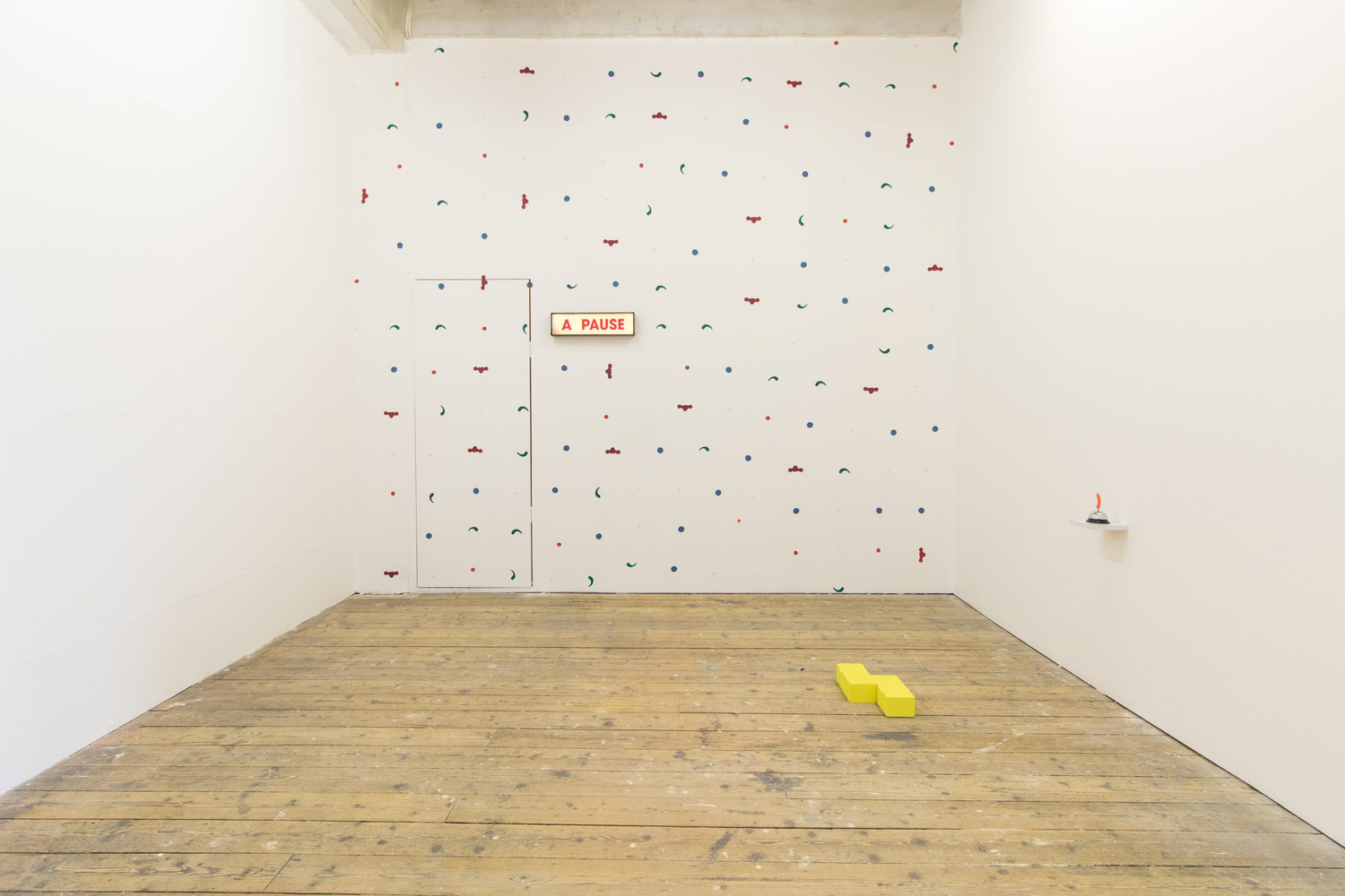
There is something decidedly uncanny. The gallery appears like a playhouse, and there’s a chance a melodrama may unfold, or that something absurd, or comical might happen. At the back, or upstage left, as maybe feels more appropriate, is a closed door. To the right is a lightbox. It’s the kind you’ve seen in old television studios, the sort that flashes to give an instruction, to demand that laughter or applause land in the right places. This lightbox shines solidly, some of the letters are missing, and the ones that remain are rearranged to say A PAUSE. So, something has happened here. I wonder what it was. There is a sense of the hauntological, this is an exhibition that deals with ghosts of the past. The wall is portioned by a series of symbols, a regimented procession, each placed nine inches apart from the last. Circles, inverted triangles, shapes like commas, and what looks like an isolated vertebra. ‘Presenting… Rainbow II, wearing, Shy Girl, Beside the Seaside, Spontaneous Combustions, Cottage by the Sea, Pursuit of Happiness, Pucker Up’. That’s the title, the lightbox and wall painting are components of a collaborative artwork, the first of two by Garth Gratrix and Chester Tenneson on display. The artwork title brings together borrowed names from domestic shades of paint, and these are the colours we see. The names hint at the lives of both artists, for example, they both grew-up in seaside towns. There are also nods to queerness and performativity with words and phrases like cottage, shy girl, and spontaneous combustions. Garth’s father once performed as a Christian clown called Rainbow. Some of the shapes seen on the wall, including the yellow cross, or the red circles of rosy cheeks were details from his makeup. The ivory wall, in this knowledge, calls to mind the Clown Egg Register, where clowns commit their unique face to an egg for posterity. In the same way, this artwork certainly implies a legacy, the way a son is expected to follow in his father’s footsteps. Here Garth positions himself as Rainbow II and is symbolised on the wall as an inverted pink triangle. It was originally intended as a badge of shame in Nazi concentration camps but was reclaimed to denote identity and pride.
To stage left, is a small shelf, placed apparently awkwardly at crotch height. Sat upon it is a concierge bell, but the button on the top is replaced by a jocular and perfectly orange plastic sausage. Below it, on the floor, are two yellow blocks with indentations. The sausage and bell are objects from Chester’s studio, and the nine-inch blocks were depressed by Garth’s knees whilst kneeling before it. Garth has a nine-inch rule, a working method as incongruous as it is practical. This second collaborative artwork is fully aware of its end-of-the-pier implications and innuendos. ‘You can ring my bell, ring my bell’ as Anita Ward once suggestively sang. I wonder if this particular bell still rings. The work, which is titled ‘Pursuit of Happiness (put away the dishes)’, directly references the disco-classic and its passionate propositions, but also piety, kneeling to pray, pursuits of happiness both sexual and religious. In both artworks Garth and Chester, through working together, have found unexpected crossovers and common ground. A shared interest in humour, play, and the power of appropriating everyday objects. Also, the fact both artists grew-up in the shadow of Section 28 censorship during the 1980s/90s. Something that effectively removed LGBTQIA+ lives and voices from government policy and education. Their exhibition has a simple premise; it explores lived experience, relationships between the artist’s body and object, language, space, and physicality, all of which is seen through the lens of the queer outsider.
Downstage left is ‘no rhythm in cymbals, no tempo in drums’, a solo-artwork by Chester. It’s a hollowed-out dart board with a bicycle wheel frame. It’s from his childhood bicycle and therefore stands as a symbol of all those formative explorations, a bike, after all, is a physical means of finding and examining your place in the world. There’s a missed throw, and the dart has landed outside the board between the 4 and 13, perhaps caught somewhere on the journey to adolescence. Maybe there was a darts match here. This artwork also nods to that much cherished television staple of the 1980s/90s, Bullseye. ‘You can’t beat a bit of Bully’. For Chester, the show provided a weekly cast of masculine heroes. Hairy tattooed forearms, beer bellies, medallions, smoky lenses. There was a certain understated and unassuming glamour to it all, and not to mention those glitzy prizes; his and hers wristwatches, and Bully’s special prize… a kiddie’s bike. Of course, when we see repeats of Bullseye today, it’s an often-uncomfortable navigation through outdated views. For example, the gendered consolation prizes, men got robust tankards; women got dainty goblets.
The final artwork, downstage right, stays with the theme of gender, and is a video by Garth titled ‘even when i’m being good to you’. This, and the exhibition title, are lyrics from the Madonna song Hanky Panky. In Garth’s video, a limp wrist is seen flicking and fluttering silk handkerchiefs between clasped fingertips. The gesture is alluring and coquettish, a handkerchief historically symbolising a range of social positions and gendered gestures. Courtship and love, infidelity and revenge, or strategically dropped to attract the attention of someone you fancied. The hanky seen here is in different pastel hues, and Garth, just as in the wall painting, is interested in how meaning is coded through colour. In particular the adoption by clandestine or peripheral groups. The hanky code, for instance, was first used by gay men in San Francisco to communicate a sexual preference, a different colour worn in the rear jean pocket, either left or right to denote a preferred role. However, this code has never been fixed, and is constantly re-written and updated. Garth is interested in the absurd meanings we project onto colours as a way to explain ourselves.
Absurdity and identity are the key ingredients that make this exhibition. In a gallery setting it’s often the case that there’s little room for the playful, the blithe, but here it is present in welcome abundance. This humour, however, is there to work through the complex bewilderment and othering of queer experience and finding a place in the world. As Madonna once said, ‘I can’t seem to fight the way I feel’.
—
Photo by Benjamin Nuttall
The exhibition at Liverpool’s CBS Gallery in July 2021 formed part of ‘In Collaboration With…’ a series of queer collaborations led by artist Garth Gratrix, supported by Arts Council England