A text written for the 9 inch book published to accompany the Garth Gratrix exhibition 'Shy Girl' at Grundy Art Gallery, Blackpool in 2020
To enjoy Blackpool, you have to surrender yourself to it. It’s a place that requires all of you or nothing. It’s so over-the-top that it’s only natural that Blackpudlian artists working amongst the visual clutter seem to adopt an instinctive antithetical position to try and make sense of their surroundings. These artists (of which there is a strong community) are more interested in minimalist abstraction than the all-out garish maximalism you might expect.
Garth Gratrix is arguably at the forefront, and has Blackpool written through him like a stick-of-rock; it’s where he was born, and it’s where he continues to live and work. The visual language of the seaside has therefore, by a combination of osmosis and choice, become entrenched in his psyche. Shy Girl at Grundy Art Gallery is an exploration of what it means to have Blackpool as an indelible part of himself, an exploration of the tension between his hyper-visual environment, and his peripheral geographical positioning as a way of reordering personal history.
In his new installation, Gratrix has carefully distilled his experience of Blackpool by embracing one of the most prevalent, but contrarily most hidden elements of the town’s iconography, the stripe. Stripes are everywhere, yet they become easily forgotten through repetitive visual saturation. From the fabric of deckchairs, Neapolitan ice-cream, bathing huts, windbreakers, pick-n-mix bags and beach towels, stripes are often adopted to denote a coastal provenance, and as a habitual signifier of proximity to the edge.
It’s blue and white stripes that form the basis for a sculptural intervention titled ‘Shy Girl at the Cottage by the Sea’, and for good reason. Gratrix responds to the existing architecture of the gallery’s rotunda and uses these stripes to speak of his own biography in several ways. Blackpool deckchairs, for example are familiar for their succession of nine blue and white stripes, and here nine is an important number. Gratrix works with a rule of nine, a rule which has become a mainstay of his approach to art and curation: “I enjoy the challenge of working with restriction” he tells me.
The stripes that enclose the rotunda balcony are nine inches in width, and are ordered nine inches apart, “it’s to do with the dating app cliché of asking if you have a nine incher”- a familiar tongue-in-cheek gay-male trope. The other reason he selects blue and white stripes is a nod to the original football strip of Blackpool FC, where his grandfather Roy Gratrix was once a legendary player. It also represents the uniform of concentration camp prisoners, his other grandfather was a detainee during the Second World War, nightmarish and beyond comprehension, a place where homosexuals perished, identifiable by a pink triangle worn on their breast:
“I’m interested in what an artist chooses to hide or exhibit. There’s an element of machismo in the construction of this installation that remains hidden, it was a hands-on process building the work; going up and down a scaffold tower, lifting, carrying, cutting, measuring wood and paint.”
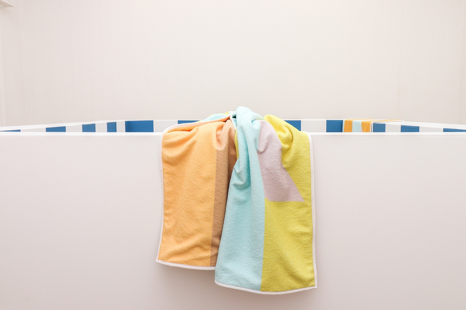
On top of the built structure are three printed beach towels, two carefully positioned, the other it seems was hurriedly cast aside. They have titles such as ‘Shy Girl Wave Hello Beside the Seaside’ or ‘Shy Girl Freshly Squeezed by the Seashore’, phrases taken from the names of household emulsion paint, cut-up and spliced into new relationships. Gratrix takes the colour charts and isolates the names to make new sentences, suggesting something of the end-of-the-pier; baudy, playful, or as he says, “Kenneth Williams” style innuendo.
The paint names are selected due to their appropriation of queer cultural language, and as a formulaic way of suggesting coastal camp. Dancing Bear, Flamboyant Flamingo, Nice Tan, Cottage, all words that have multiple associations or readings. When Gratrix brings these names together he doesn’t necessarily know for sure to what colour they will correspond, although admittedly there are a few hints. The beach towels are therefore random, almost, but not quite automated in their resulting palette. We also see the pink triangle worked into the designs, a symbol of persecution that has been reclaimed by the LGBTQI+ community as a symbol of resilience, unity, power and kinship.
The beach towels seen here function in different ways, the two that are draped immaculately and un-creased over the rotunda balcony remind us of the old holiday clichés; the use of towels to claim space or denote territory, often seen as an aggressive action. They also conversely invite or suggest relaxation, an intimate object that exists to be in close contact with the body, shy in one way, but also an apparatus of performance, a platform to be seen, to show off. Gratrix is interested in the history of bathing, and how the activity was once strictly gender segregated, an arena for same-sex encounters, and he has a fascination for the clandestine nature of it all. The third towel suggests that something has or will happen, and it is important that the queerness presented isn’t purely aesthetic, but that it’s loaded with implication. “I like the idea that the towel was cast-aside in an impulsive moment, as if someone had run off skinny-dipping. It’s waiting for its owner to return.”
Of course, beach towels are an aspirational symbol, they are signifiers of hope and promise, an object that suggests getting away, a release from the norm. This is akin to the aspiration responsible for Blackpool’s emergence in popularity; historically those seeking a release from the smog-choked air of the industrial towns flocked there for short breaks that offered an attainable escape. People still visit Blackpool today for much the same reason, to momentarily forget themselves, and Gratrix has the difficult task of attempting to make order with the people’s playground as his backdrop. It’s a hard task, he must deal with the cacophony that surrounds him in order to distance himself:
“In Blackpool it is always expected of you to give too much, and therefore it’s a hard place to queer, as you can see it’s implicitly camp already, and that has its challenges for a queer artist who is trying to say something new.”
Historically minimalist art comes from areas of cacophony, of visual excess, and you only have to think of New York in the second half of the 1960s, as one example, to realise that it doesn’t hail from zen surroundings. There is also a clear precedence for artists visually reducing the notion of the sea, the solemn opaline sea-paintings of LS Lowry, or the urgent exploratory sketches of JMW Turner communicate the sky and the sea in no more than a meeting of two stripes, so vast to comprehend it’s reduced to its essentials. The challenge to Gratrix is to allow his stripes to hold or suggest deeper meaning, and that’s the clever part. Stripes have been a favourite manifestation of minimalism for exactly the opposite reason, they are read at once, as a whole, they oppose interpretation, but the stripes used by Gratrix shrewdly project significance. The installation is multi-layered and original. Anyone who encounters it will certainly find something familiar, it can be understood anywhere, and that’s no easy task in an installation of reduction.
Image: Shy Girl at Grundy Art Gallery, Blackpool - 8th January - 28th March 2020, courtesy of the artist